

Every year, Pantone chooses and announces the special Pantone Color of the Year, a moment that the design and fashion world anxiously anticipates and waits for towards the beginning of the new year. The color Pantone chooses becomes a staple choice in fashion in the year to come, so it's an important moment for many in the art and design world, from fashion designers, to makeup and beauty artists, to interior designers, to of course the every day fashionista. Only one color, out of an endless amount of beautiful colors, is chosen to represent the coming year, so the meaning it holds is an important one.
This year, for the first year ever, Pantone announced two colors for the 2016 Pantone Color of the Year! With such a huge break from the norm, Pantone of course did so with good reason. In a world that feels more and more difficult to comprehend sometimes, Pantone chose two colors that represent a sense of balance and peace to help "consumers seek mindfulness and well-being as an antidote to the stress of modern day lives." The colors they chose are Rose Quartz (PANTONE 13-1520) and Serenity (15-3919), "a harmonious pairing of inviting shades that embody a mindset of tranquility and inner peace."
Pantone further explained that the light pink Rose Quartz, "is a persuasive yet gentile tone that conveys compassion and a sense of composure," and the cool blue Serenity, "comforts with a calming effect, bringing feelings of respite and relaxation even in turbulent times."
You can watch the two colors in action in their video to announce the Pantone Color of the Year 2016:
One of the reasons that they chose these two colors if for their duality and a statement for the need of gender norms to change when it comes to color and design. Leatrice Eiseman, Executive Director of the Pantone Color Institute, explained in the official press release, "In many parts of the world we are experiencing a gender blur as it relates to fashion, which has in turn impacted color trends throughout all other areas of design. This more unilateral approach to color is coinciding with societal movements towards gender equality and fluidity."
We can certainly get behind these 2016 Colors of the Year, not only because of their special meaning, but because they are two colors that are seen prominently in prom dresses! Whether on their own or paired together through patterns like floral prints and color blocks, these are two staple hues of prom. And now when you wear them, they'll have a special meaning, too! Search through our pink prom dresses and blue prom dresses to get your very own ideas on how to rock the colors - you'll find many in both sections that incorporate the two colors together.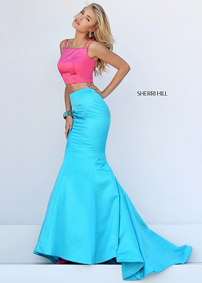 If you love this look and want to get it for prom, definitely check out the new Sherri Hill Prom 2016 dresses. The dress designer is using these two colors both as separates and together in many unique ways. One of our favorites is Sherri Hill 50466, a color blocked two piece gown that features a light pink top and light blue skirt. This dress certainly couldn't invoke the 2016 Pantone Colors of the Year in a better way!
If you love this dress and the idea of rocking pink and blue, but like darker colors more, this dress also comes in a Royal/Fuchsia color combo - the top is blue and the bottom is pink in this case. It's a great way to represent Pantone's 2016 color choices and meaning at prom or your next formal event, but through your very own interpretation.
The color combination of Rose Quartz and Serenity has a great meaning behind it, so wear the colors proudly through the new year, and many years to come!


[…] year 2016 was all about balance, with Pantone naming two colors as the Color of the Year, Rose Quartz and Serenity. Now, with 2017 upon us, it's time for a brand […]